This project was a research and layout project on the history of photographic practices and the use of photo media in visual communication, and technologies used in the present day. I created a new magazine I named 'Design Monthly', and decided upon a layout format. My aim was to make it look and feel like a stylish design magazine that I would want to read myself.
Refinement for Typography Portfolio
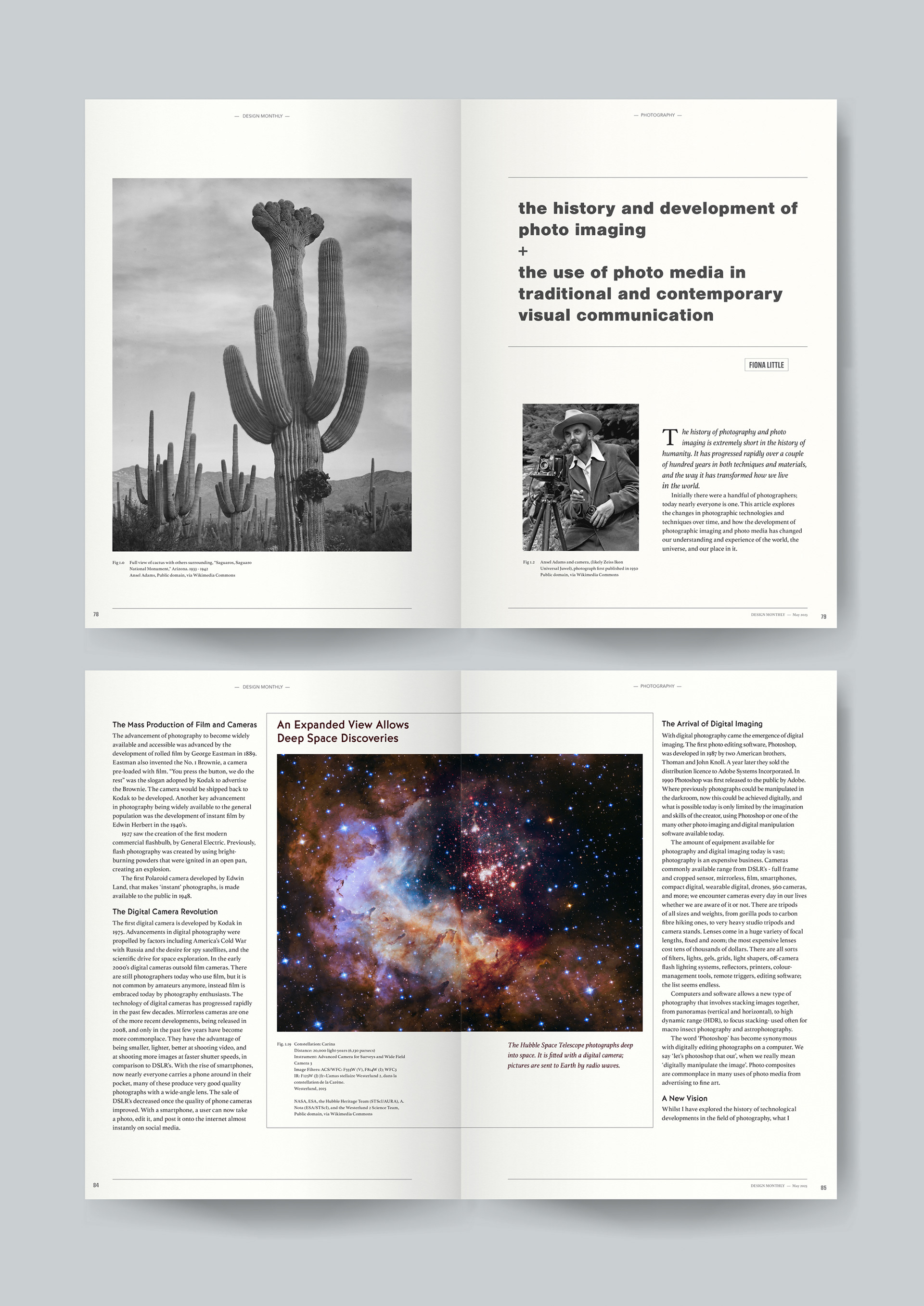
It was suggested to me that on the first page of the article the paragraph with italics was too long with too much italicized text. I decided to revisit this by breaking it up into two paragraphs, and only italicizing the first. Robin suggested I could improve the captions. The one on the left page could be moved the line up with the left of the image, similar to the other page. And the text on subsequent rows could be indented in line with where the caption text began. You can see the changes from below (initial) to above (final).
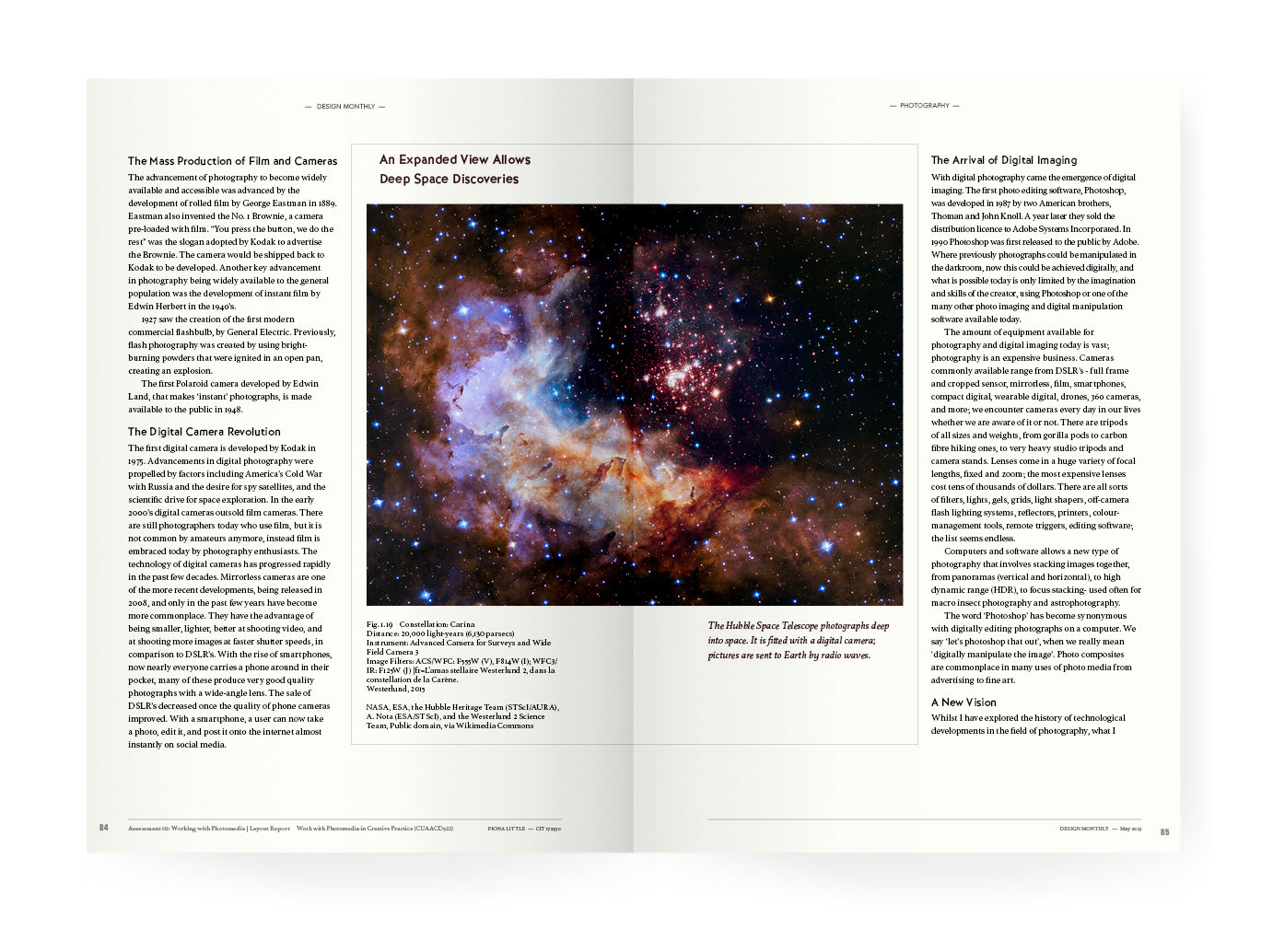
On the next spread (with the astro photography) Robin suggested the caption should be the same size as elsewhere. I can't remember why I didn't have it the same initially. I changed it and it instantly looked better. He liked my choice of typefaces.