Design Brief
Create a personal brand and identity that will be utilized in both print and screen formats
Must work in both small and large scale, colour, and black and white
Design Concept
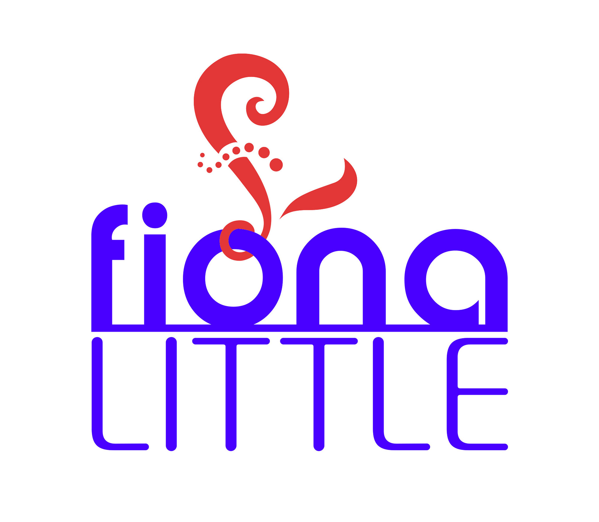
Initial concept was to portray positivity, flexibility, creativity and strength
Design Development
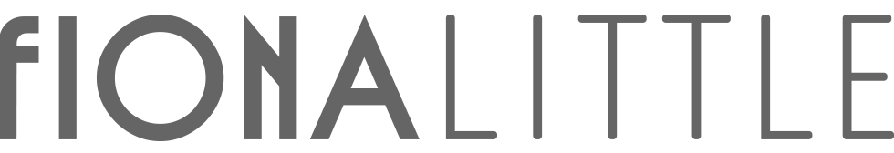
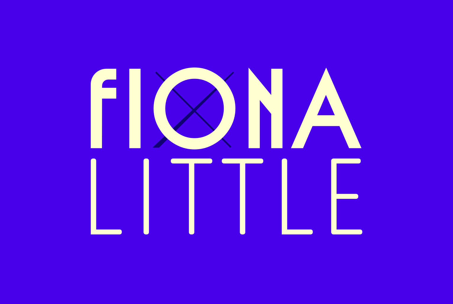
Feedback at end of year (2022) review was that the F and L combined looked like a pound symbol. I didn't like this association so when revisiting the design during the Advanced Diploma I decided to remove that element entirely; I deemed it unnecessary.
I liked the fiona on top of the little, so continued this but chose different typefaces.
I believe the final design is stronger and more refined. It is fairly simple, or reads as such. It communicates what it needs to - my name. It looks strong and unique.
Feedback
Feedback from a variety of people was all positive. Robin thought the typography was working well and liked the choices of typefaces.