Design Brief
Develop branding for the end of year CIT graphic design exhibition titled 'FUSION'.
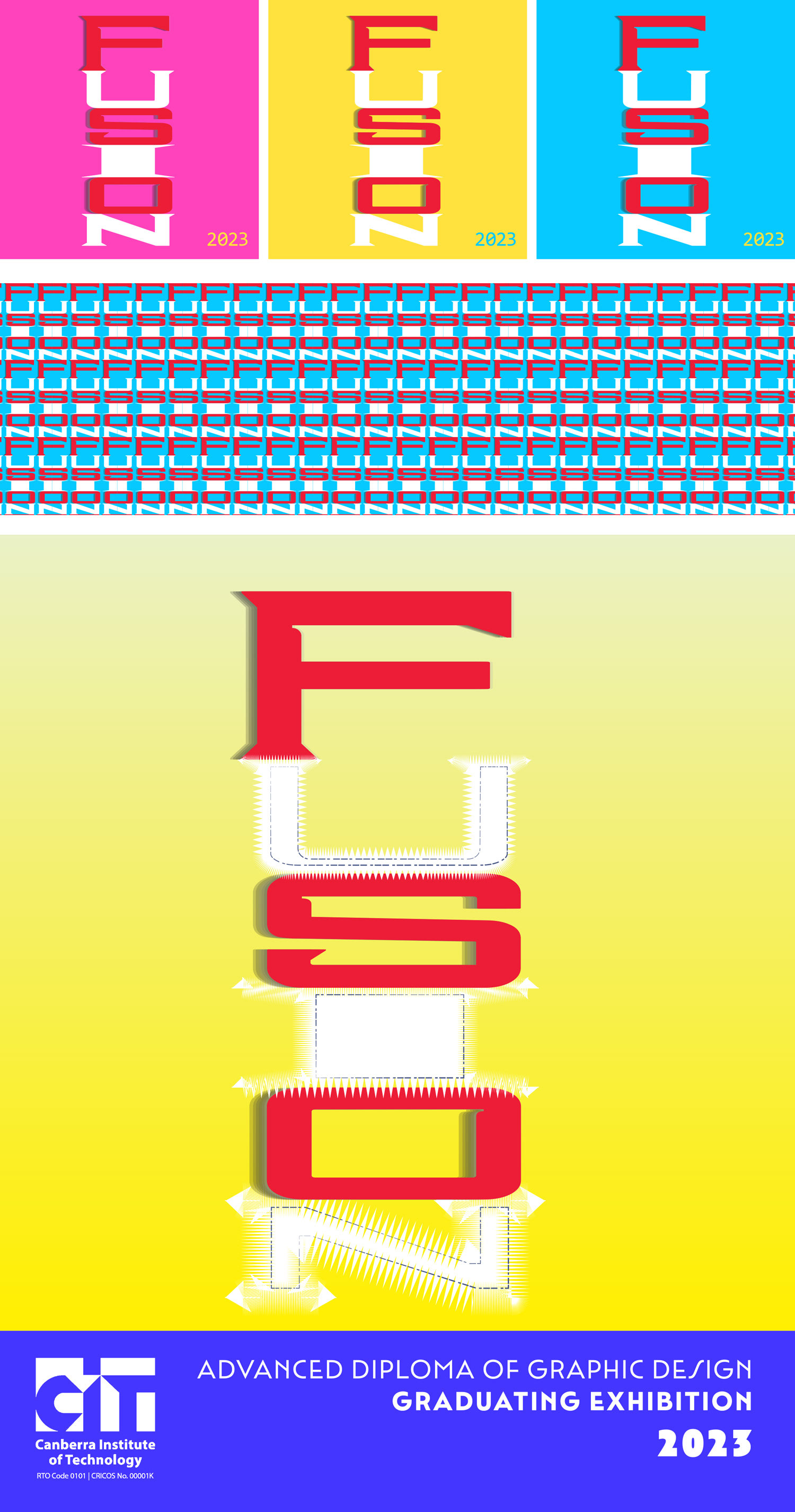
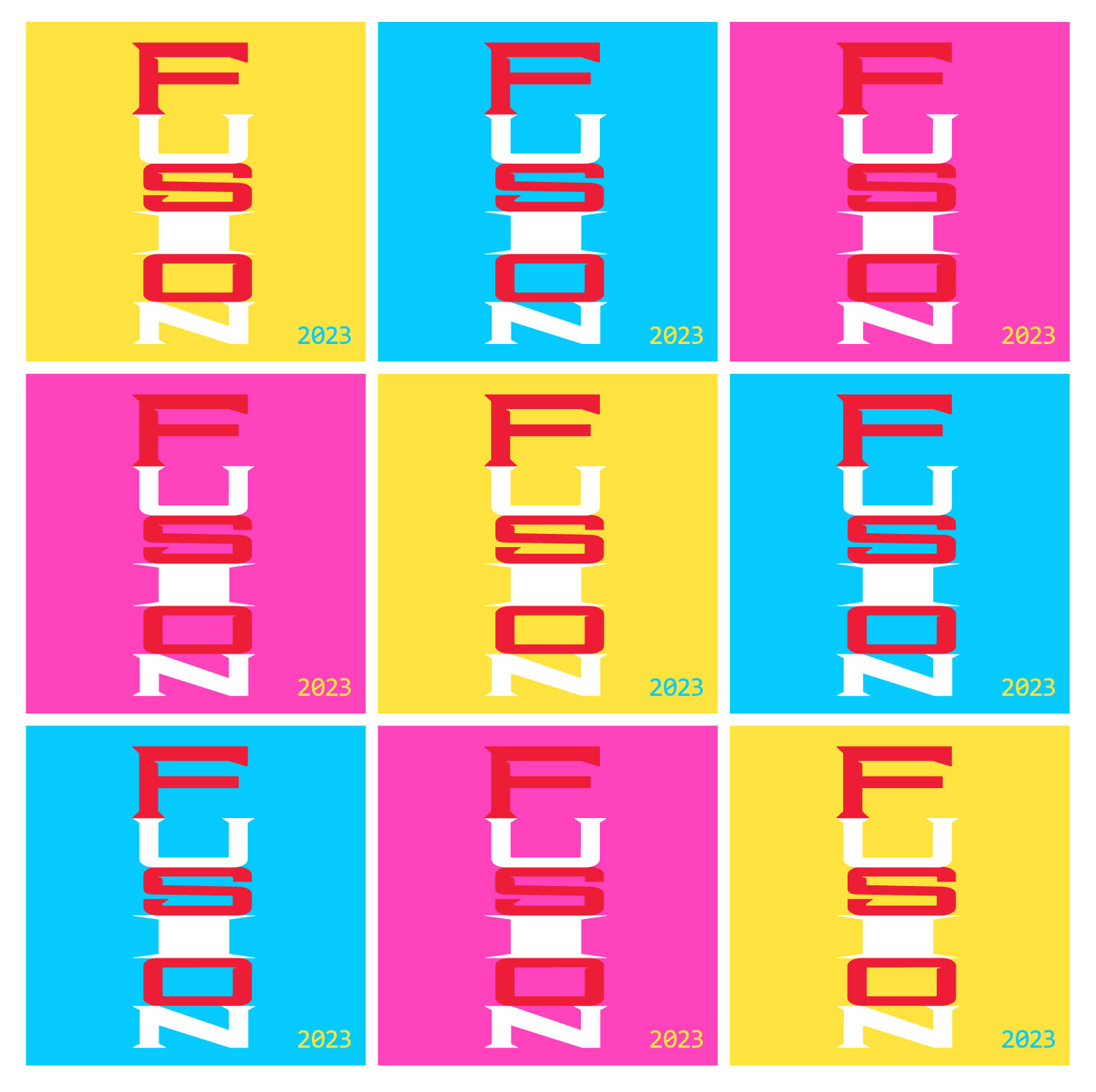
Design Concept
My concept was inspired by the research I was conducting into both the meaning of fusion, and contemporary typographic practices. The idea was that each letter was magnetic. I altered a variable typeface called Industria to work vertically and be the same width for each letter. I used bright primary colours to convey a sense of fun, energy and relate back to the printing process.
Design Feedback and Development
I had mixed reactions to this concept. Some people get really excited by it, and others seemed to not like the way it is vertical and not the easiest to read, especially with the alternating colour combination.
Feedback from Robin was that he really liked it - he seemed very enthusiastic about it but thought I should remove the shadow, which I did.