Design Brief
Explore the potential of sculptural typography through a range of different materials and techniques. The possibilities are limitless.
Design Concept and Development
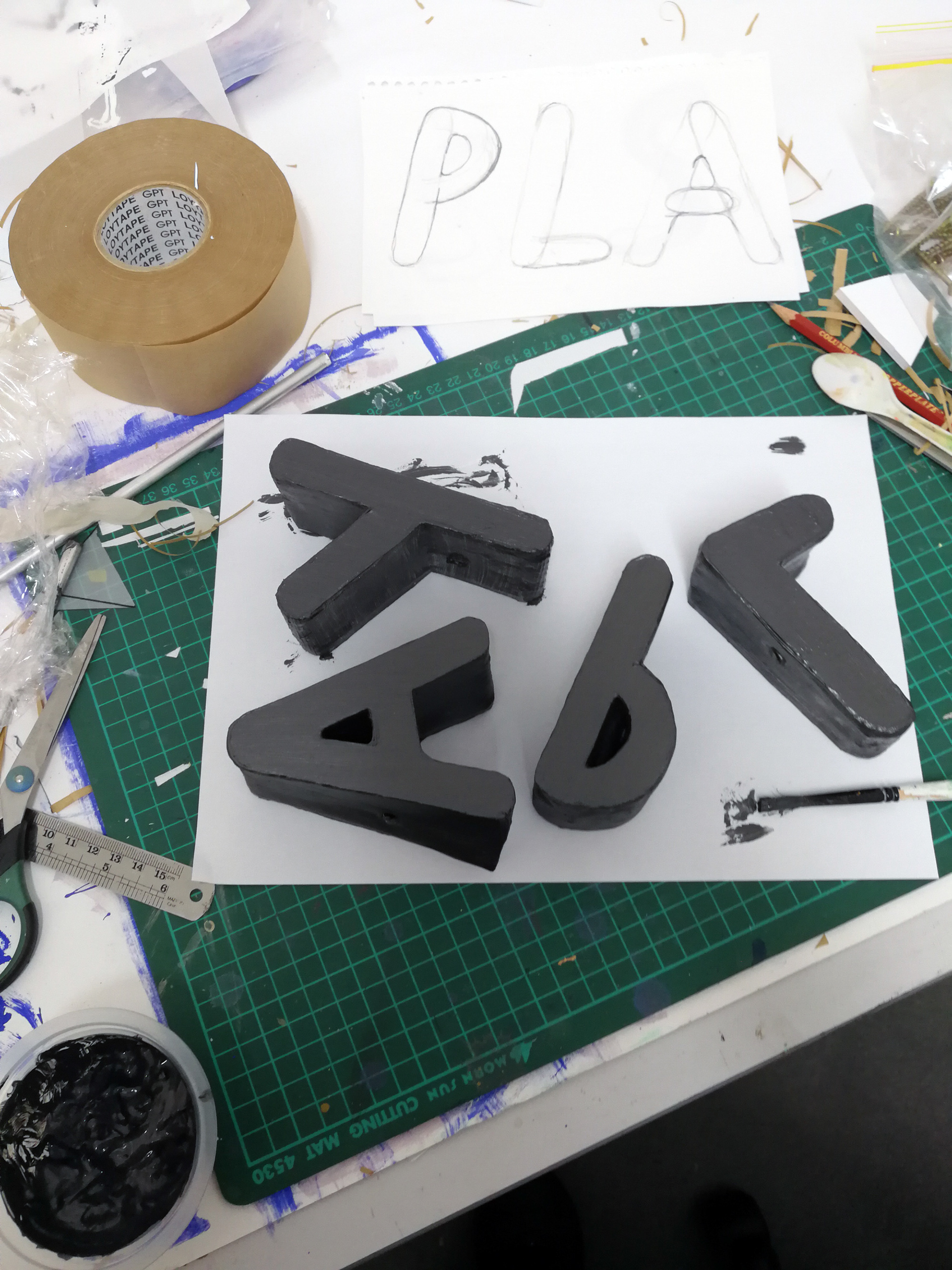
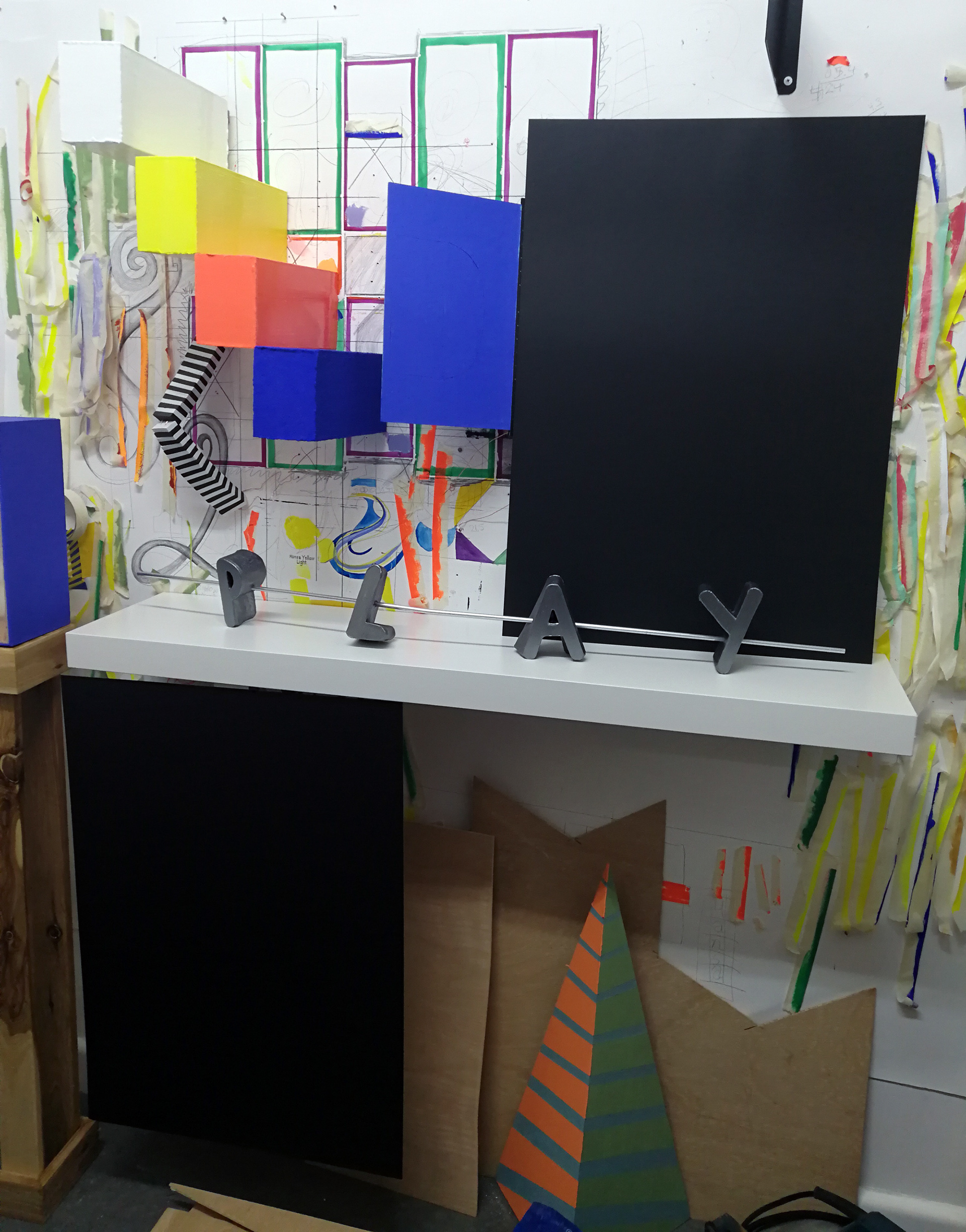
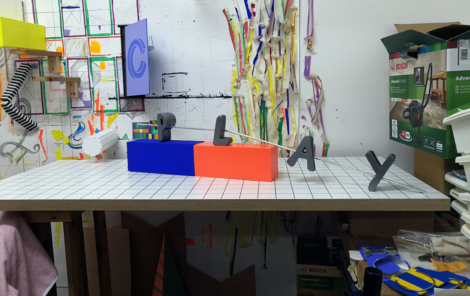
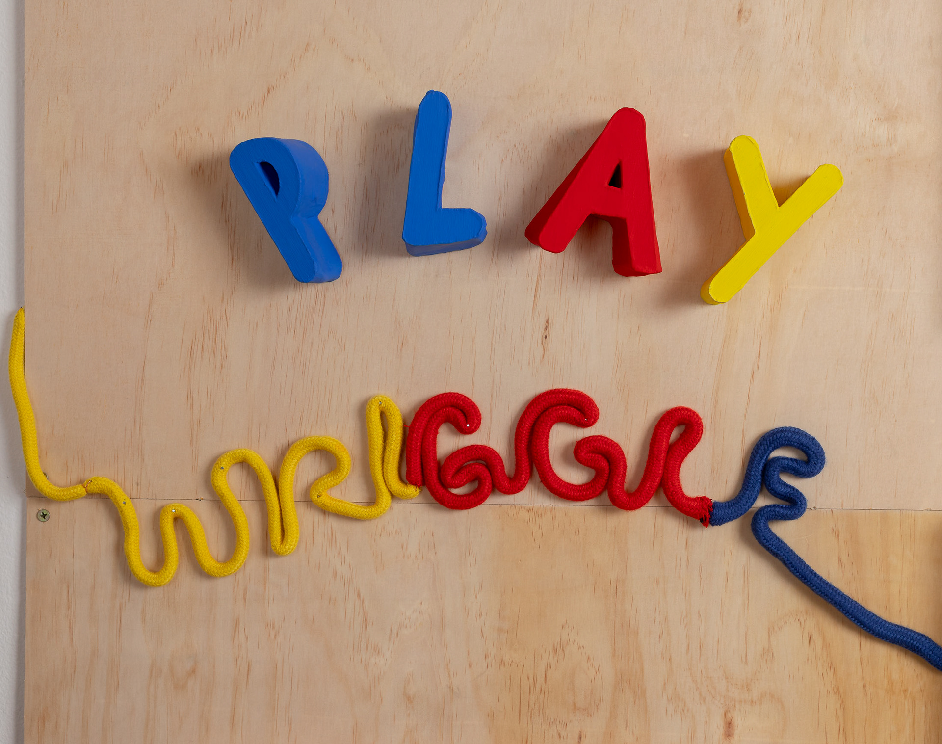
My initial concept for what ended up as the PLAY sculptural piece was to create SPLAT and have each letter on its own individual shelf off the wall, except the t would be squashed flat on the ground. After I started making the letters out of foam core, paper tape, after first sketching the letters, I decided to alter my idea. I decided to spell out PLAY. I wanted the letters and word to take a playful form. I was open to this concept developing through the making process.
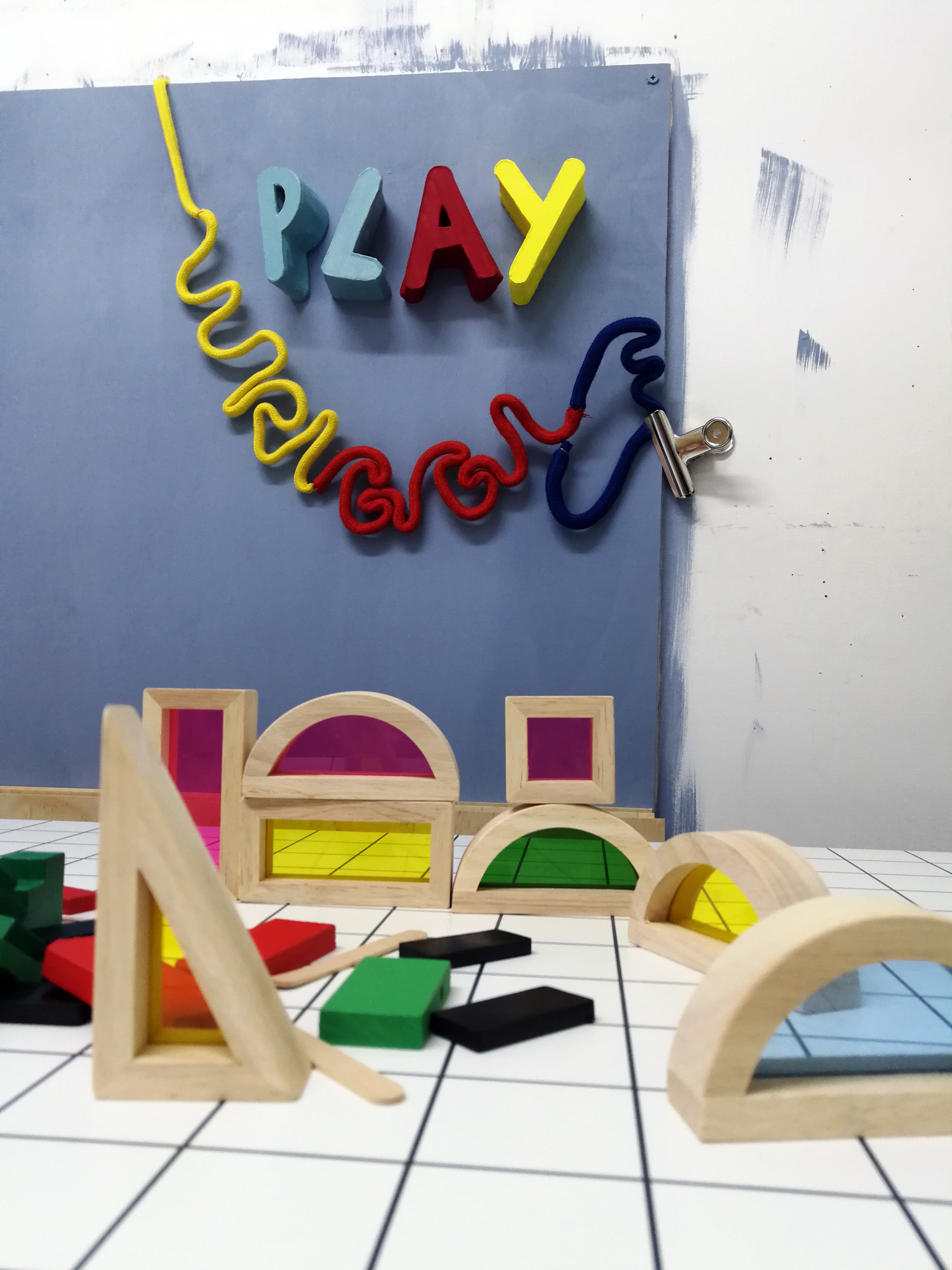
The concept with WRIGGLE was to make a playful piece of type where the form of the letters matched the meaning of the word.
Feedback and Review
Feedback during my typography discussion with Robin led to him suggesting to remove the pole that I had used to hold the letters upright, have the letters closer together and in a relationship with wriggle. He also suggested colour would benefit them.