Design Brief
Create an educational A2 poster featuring Diprotodon
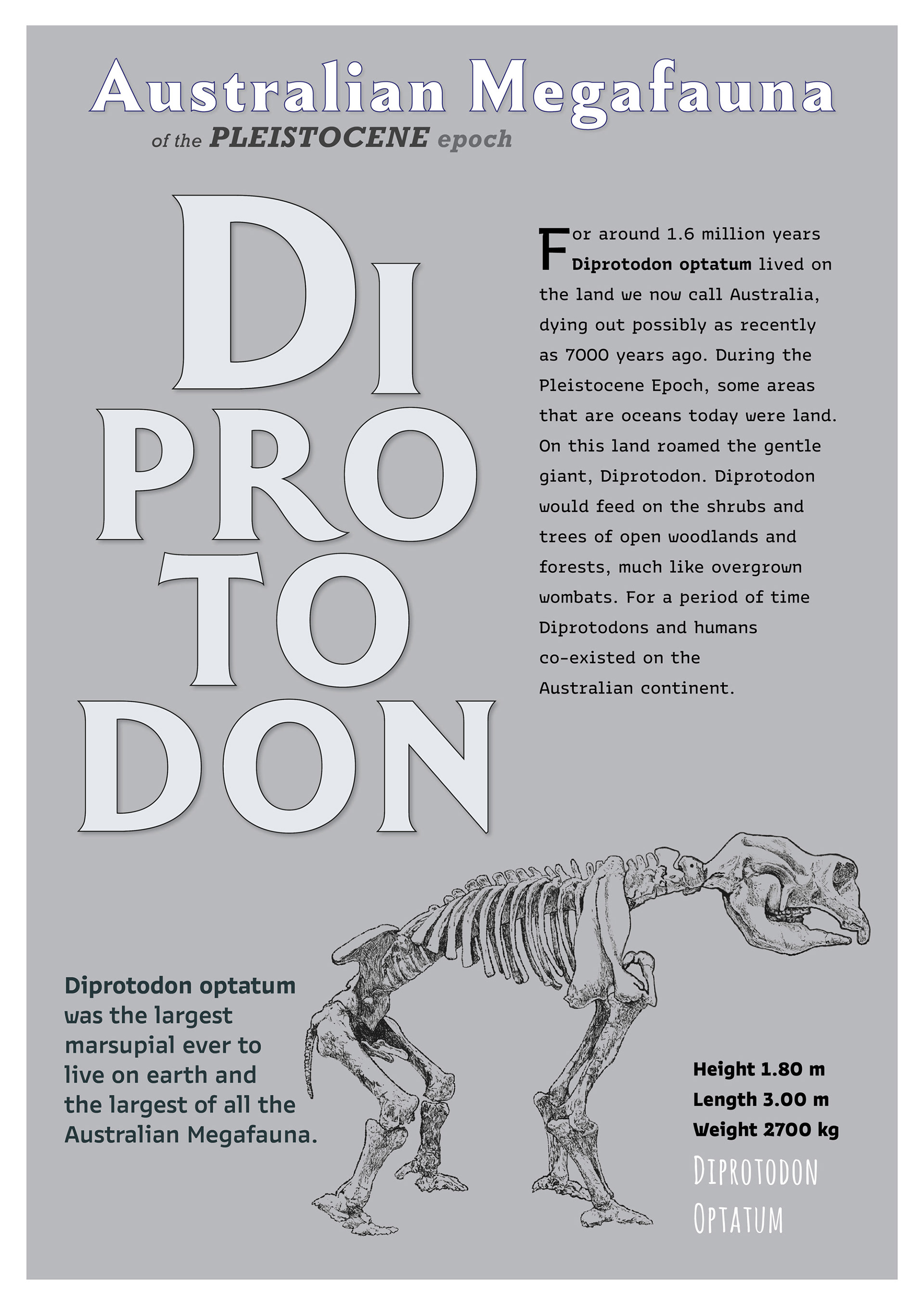
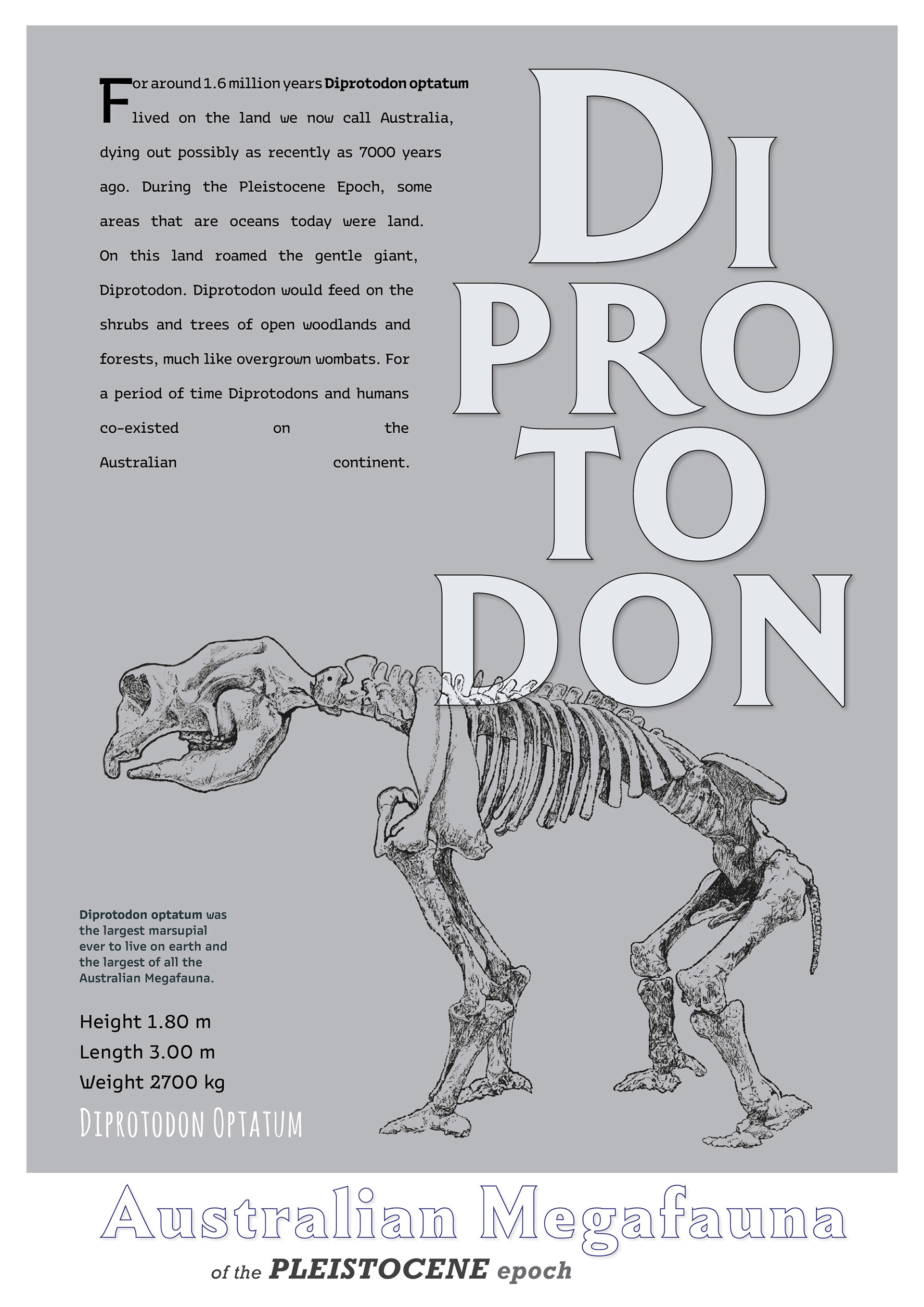
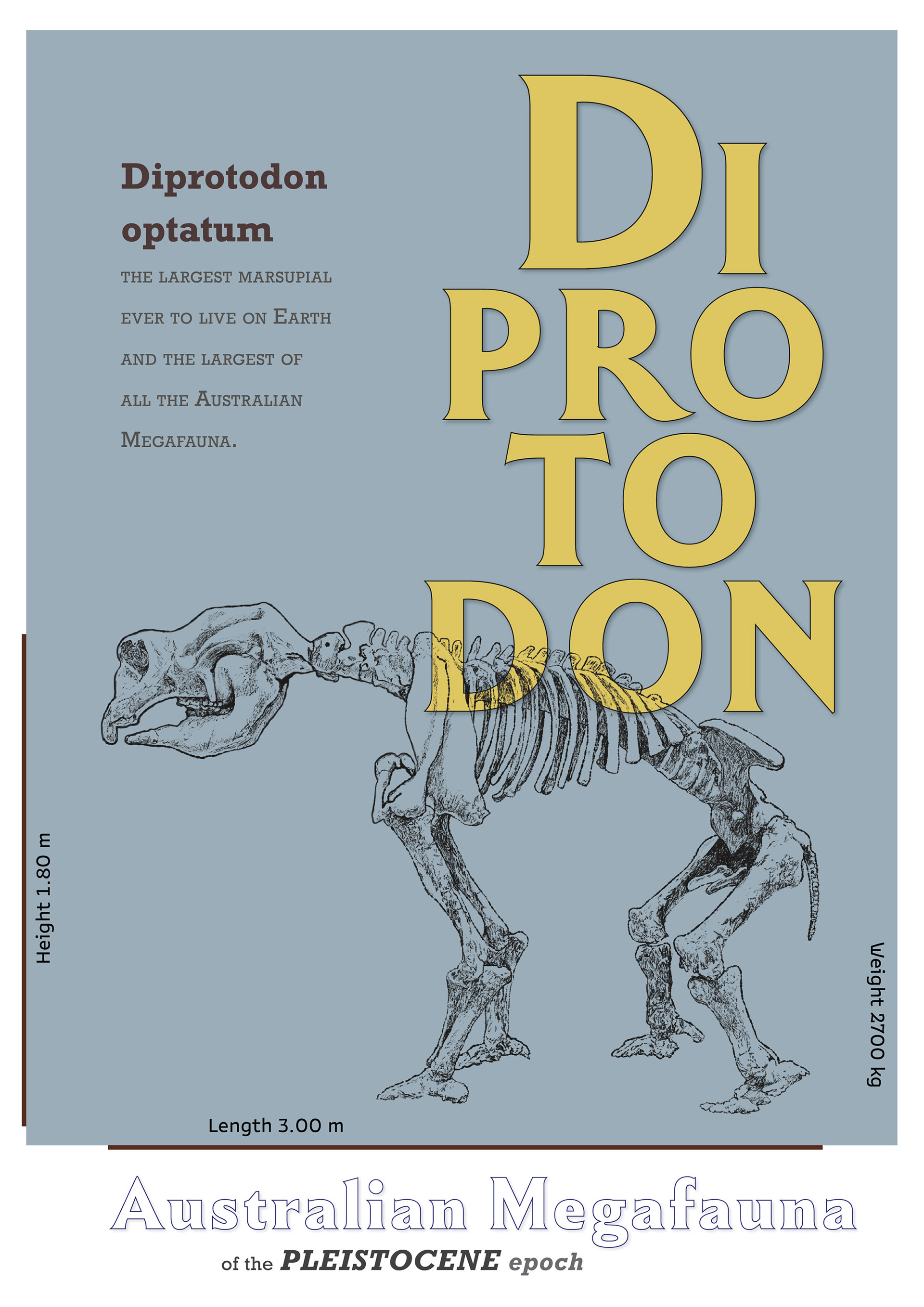
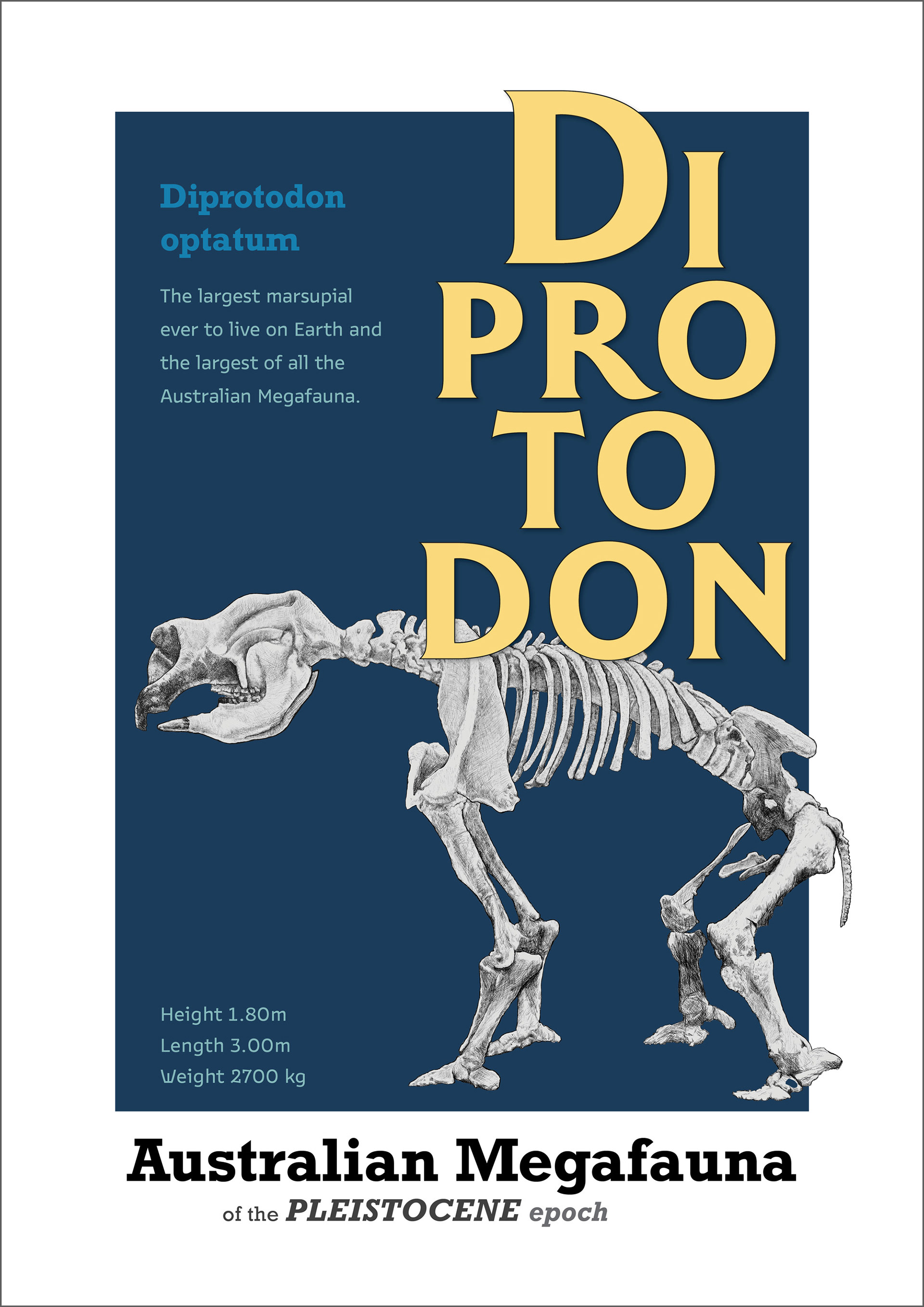
• Include key facts and an image of the skeleton
• Target audience - children and adults interested in natural history
• Mood - serious and educational, illustration to be accurate
• Poster to be sold at museum shop
• Include key facts and an image of the skeleton
• Target audience - children and adults interested in natural history
• Mood - serious and educational, illustration to be accurate
• Poster to be sold at museum shop
Design Concept and Development
• I wanted to do something interesting with the typography for the main feature word on the poster 'Diprotodon'. After my research into typographic practices, both historical and contemporary, I decided the break up the word into different lines, using a variable typeface - Winsel Variable, designed by Jeremy Dooley of Insigne Design, available through Adobe Fonts.
• Initally I had a lot of text on the poster- information about Diprotodon. I received feedback from Robin suggesting that because it is a poster, it didn't need that amount of text. I decided to cut but into just a snippet of information.
• Initially I had 'Australian Megafauna of the Peistocene epoch at the top of the poster'. The way the eye was moving around wasn't working and Brian suggested moving it to the bottom, after doing this it immediately improved the way the poster read.
• Roy suggested I had too many different typefaces and to remove the outline around 'Australian Megafauna', and make it the same slab typeface as used elsewhere. I tried this and thought it was an improvement so kept it.
• Much discussion about justification and the best way to go about this was had. I liked Robin's advice that it was best to do this by hand roughly - don't use the automatic methods in Indesign.