
Design Brief
- home-based decorated cookie company run solely by Alissa Gosh
- looking to take the next step for the future of her business and move away from being a serious hobby baker
- customers primarily purchase cookies for events
Values
- seeing the joy cookies brings others
- personal connections
Branding
- unique
- 'bucks the trends'
- memorable and recognisable
- not too complicated
- should feel personal and be a reflection of Alissa's values
- gender neutral colour palette
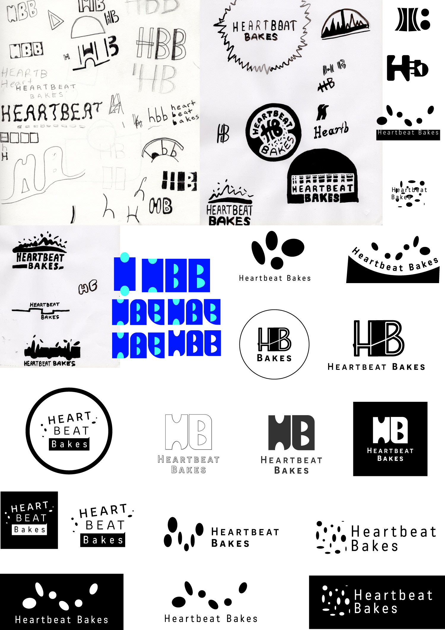
Design Concept
Above are some of the early exploratory ideas that I explored whilst coming up with my final concept for the Heartbeat Bakes branding. I kept coming back to the idea that was inspired by Alissa's love of sprinkles of using circular shapes to convey excitement and a dynamic energy. After a feedback session I was encouraged to explore this idea and take it further by introducing new shapes and combine them in a different form. The typographic solutions I was exploring at this stage were monospaced typefaces, in part because of what Alissa has expressed as her preference during the brief. She wanted the text to be easy to read and scalable.
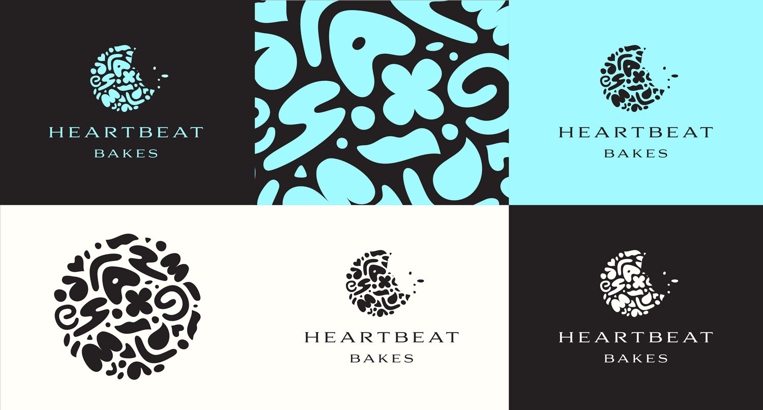
The idea I decided to go with was the creation of a brandmark that combined a lot of diffferent shapes into a ball (cookie-shaped form) of energy and potential. Alissa makes cookies in a wide range of shapes and the whole business is based around specialised creations - no two orders are the same. Since her creations are fun and usually celebrate joyous occasions, I wanted to represent this positive energy through the brandmark. Pairing this with a typeface that conveyed a premium feel was what I was aiming for initially. I tried to do this with a serif typeface.
Presentation of Design Concept to Client. 9/11/2023

Feedback After Presentation of Concept
- positive about brandmark and colour scheme
- choice of typeface could be improved to be more rounded, friendlier (Logan, Roy)
- Robin suggested looking at Garamond and Calibri italics and work at simplifying the cookie shape
- Liam and Sonny said that it needed a more contemporary sans-serif typeface that related more to the forms in the brandmark.
Design Development
- took onboard suggestions above, realised i was stuck trying to do the same thing and getting nowhere with the same type of typeface
- ended up going with Liam and Sonny's suggestion, found a typeface that I was happier with (below).
- feedback from Logan was tracking needed to be smaller
- feedback from Liam was that it was a better choice than previous (one in presentation) but I could also try brandon grotesque because the rounded forms of the letters would work nicely with the forms in the mark.
- after trying that he suggested i try in all lowercase. once i tried that i decided that it was complete and i was ready to lock it in.
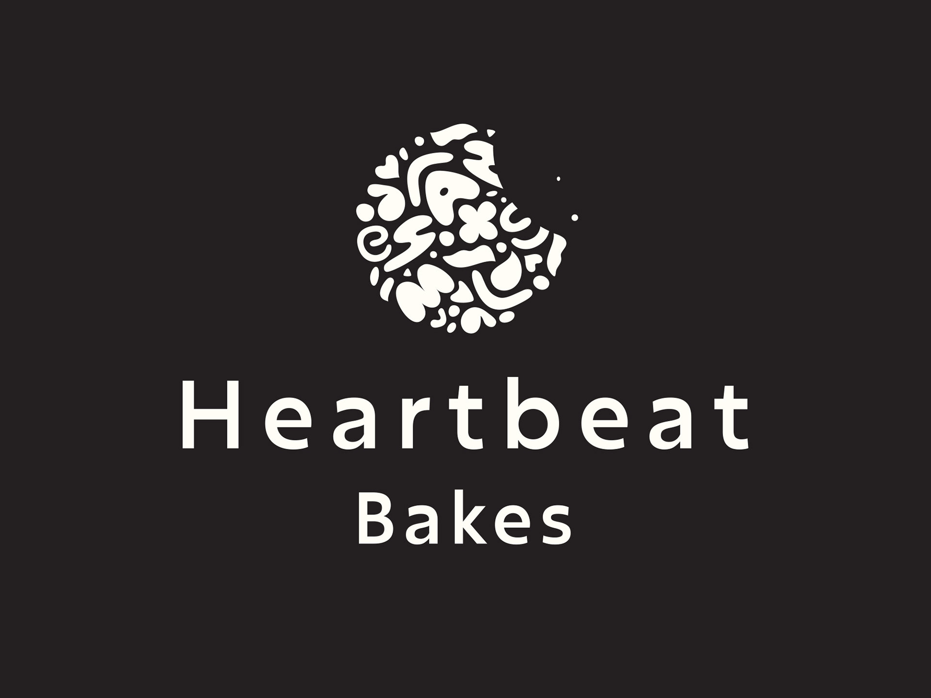

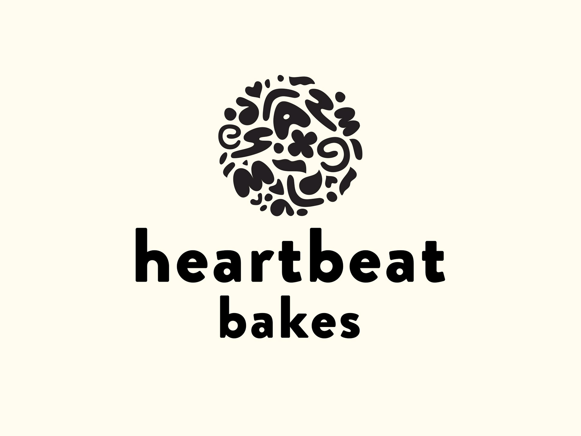
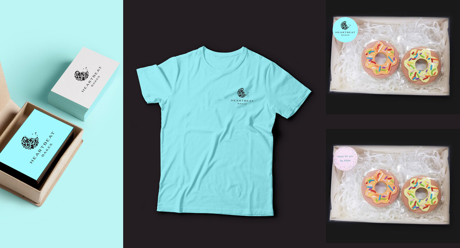
Final Logo for Heartbeat Bakes
- Typeface: brandon grotesque black, tracking: 35
Brandon grotesque was designed by Hannes von Dohren. from HVD Fonts. Available through Adobe Fonts.
- Chosen for the relationship to the forms in the brandmark; the rounded edges of the letters, whilst different, have a relationship to the rounded forms.
- Typeface gives a contemporary, fun feeling.
- Use of colour: branding has a colour scheme of black, light blue and pale cream. Gives a choice of different moods, the blue being more uplifting, the cream and black a more premium feeling, which doesn't clash with the bright coloured cookies that Alissa's produces.